A couple of days ago I was asked by one of the participants I met at the workshop I gave in DataFest Tbilisi about a simple tutorial on plotting divergent bars in ggplot2 and other bar chart stuff. I was going to write a gist with explanation but I decided to write this post instead to share with others whenever they ask during/after a workshop or in other occasions.
In this post, I will give 2 step-by-step examples:
1st- normal bar chart (with a diverging aspect) using the gapminder dataset.
2nd- divergent bars using the starwars dataset from dplyr package.
Example 1
Dataset (gapminder)
## load libraries
library(gapminder)
library(tidyverse)
Given the gapminder dataset which includes the the GDP per Capita for 142 countries, let’s say we are interested in creating a plot to answers the question: “What is the percentage change in GDP per capita between 1997 and 2007?” .
We need to have a dataframe with each country and the corresponding change, something like this:
## # A tibble: 25 x 4
##    country            year_1997 year_2007 gdp_change
##    <fct>                  <dbl>     <dbl>      <dbl>
##  1 Argentina             10967.    12779.      16.5
##  2 Bolivia                3326.     3822.      14.9
##  3 Brazil                 7958.     9066.      13.9
##  4 Canada                28955.    36319.      25.4
##  5 Chile                 10118.    13172.      30.2
##  6 Colombia               6117.     7007.      14.5
##  7 Costa Rica             6677.     9645.      44.5
##  8 Cuba                   5432.     8948.      64.7
##  9 Dominican Republic     3614.     6025.      66.7
## 10 Ecuador                7429.     6873.      -7.49
## # ... with 15 more rows
I will not explain the data manipulation steps and I will assume you have your data in this format.
Data Visualization
Create basic bar plot
To give an answer to the question “What is the percentage change in GDP per capita between 1997 and 2007?”, you’d Probably start with putting the country on the x-axis and the gdp_change on the y_axis.
Now you will have a couple of issues:
1- the countries names are overlapped.
2- the bars are ordered according to the country name, instead of the value of the gdp_change
## plot gdp change versus country
ggplot(data = gapminder_subset,
       aes(x = country, y = gdp_change))+
  geom_bar(stat = "identity")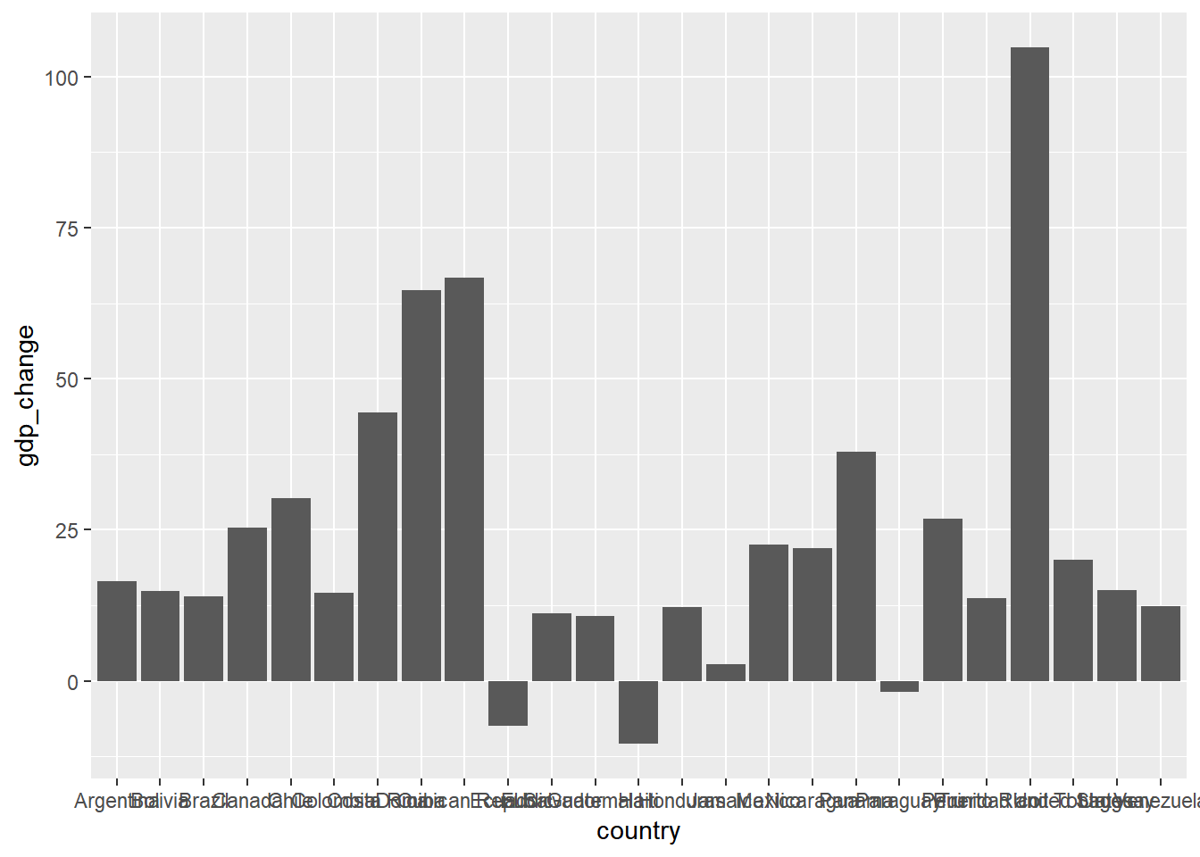
Flip axes
For the first issue, you could either rotate the country names or flip the whole chart to put the country on the y axis. We will go with the second solution, which could be achieved by one line coord_flip().
## flip axes
ggplot(data = gapminder_subset,
       aes(x = country, y = gdp_change))+
  geom_bar(stat = "identity")+
  coord_flip()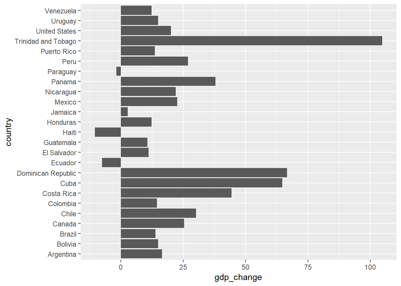
Order countries by gdp_change
For the second issue, you can use reorder() to sort the bars based on a certain variable; which is gdp_change here.
## order by value
ggplot(data = gapminder_subset,
       aes(x = reorder(country, gdp_change), y = gdp_change))+
  geom_bar(stat = "identity")+
  coord_flip()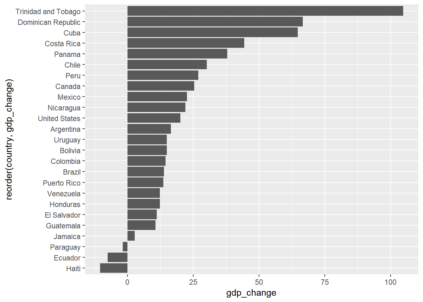
Color bars based on gdp_change value
So with these few lines you have your basic bar chart. But you might want to color the bars based on whether the gdp_change is positive or negative. There is more than one way to do this.
One fast way is to pass an expression gdp_change > 0 to the fill attribute. It is as if you say “check whether the change is positive or negative and color the bars based on the result”.
ggplot(data = gapminder_subset,
       aes(x = reorder(country, gdp_change), y = gdp_change,
           fill = gdp_change > 0))+
  geom_bar(stat = "identity")+
  coord_flip()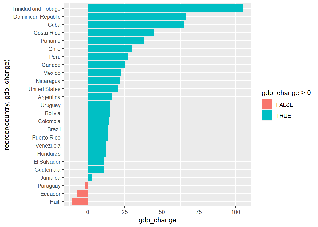
Another way is to add a new column gdp_change_positive to gapminder_subset datfarame to hold this value.
gapminder_subset <- gapminder_subset %>%
  mutate(gdp_change_positive = gdp_change > 0)

head(gapminder_subset)
## # A tibble: 6 x 5
## country year_1997 year_2007 gdp_change gdp_change_positive
## <fct> <dbl> <dbl> <dbl> <lgl>
## 1 Argentina 10967. 12779. 16.5 TRUE
## 2 Bolivia 3326. 3822. 14.9 TRUE
## 3 Brazil 7958. 9066. 13.9 TRUE
## 4 Canada 28955. 36319. 25.4 TRUE
## 5 Chile 10118. 13172. 30.2 TRUE
## 6 Colombia 6117. 7007. 14.5 TRUEThen you you can pass it to the fill attribute. This approach would be useful if you need to reuse the values in this column for other purposes like filtering or anything else.
ggplot(data = gapminder_subset,
       aes(x = reorder(country, gdp_change), y = gdp_change,
           fill = gdp_change_positive))+
  geom_bar(stat = "identity")+
  coord_flip()
Now you can make some modifications to customize your figure. For instance:
use
labs()to define the axes labels and figure title.remove the guides about the fill colors by setting
fill == FALSEinguides()and pick the theme you want to use.
Polish the final figure
ggplot(data = gapminder_subset,
       aes(x = reorder(country, gdp_change), y = gdp_change,
           fill = gdp_change_positive))+
  geom_bar(stat = "identity")+
  coord_flip()+
  labs(x = "Country", y = "GDP per Capita Change %",
       title = "Percentage chage in GDP per Capita",
       subtitles = "Americas (1997 to 2007)")+
  theme_minimal()+
  guides(fill = FALSE)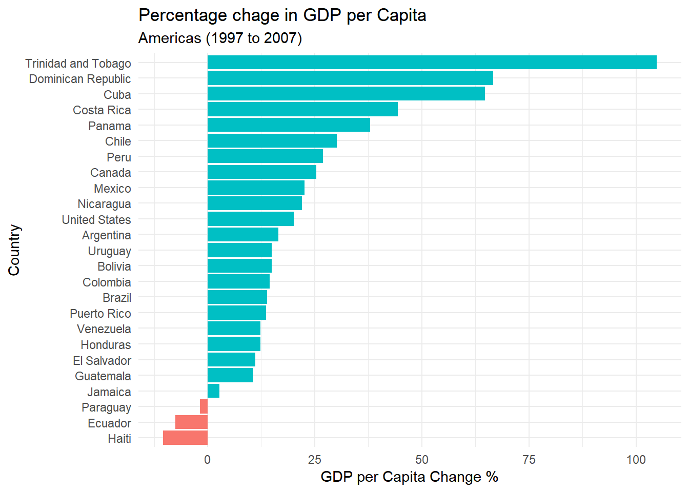
So this is a normal horizontal plot, but sometimes people consider a divergence aspect since the values can be higher or lower than base line (here zero). But the real divergent bars usually have one more variable as shown in example 2.
Example 2
Dataset (starwars)
Let’s say we have a summarized dataframe from the starwars dataset including the average height of the characters in each homeworld grouped by gender. You can visualize this in different ways according to what you want to emphasize. here we will focus on the divergent bars version.
## summarize data
starwars_chars <- starwars %>%
  filter(gender %in% (c("male", "female"))) %>%
  filter(!is.na(homeworld)) %>%
  group_by(homeworld, gender) %>%
  summarise(average_height = median(height, na.rm = TRUE)) %>%
  group_by(homeworld) %>%
  # mutate(n = n()) %>%
  filter(n() == 2) %>%
  ungroup()

## display data
starwars_chars
## # A tibble: 12 x 3
## homeworld gender average_height
## <chr> <chr> <dbl>
## 1 Alderaan female 150
## 2 Alderaan male 190.
## 3 Coruscant female 176.
## 4 Coruscant male 170
## 5 Kamino female 213
## 6 Kamino male 206
## 7 Naboo female 165
## 8 Naboo male 185
## 9 Ryloth female 178
## 10 Ryloth male 180
## 11 Tatooine female 164
## 12 Tatooine male 183Data Visualization
If you want to have divergent bars, you need to have the values of one group as negatives. You can use ifelse() to multiply the values for the males by -1.
starwars_chars <- starwars_chars %>%
  mutate(average_height = ifelse(gender == "female",
                                 average_height,
                                 -1*average_height))
Now you can simply plot a normal bar plot and use the fill color as the gender
## plot divergent bars
starwars_chars %>%
  ggplot(aes(x = homeworld, y = average_height, fill = gender))+
  geom_bar(stat = "identity")+
  coord_flip()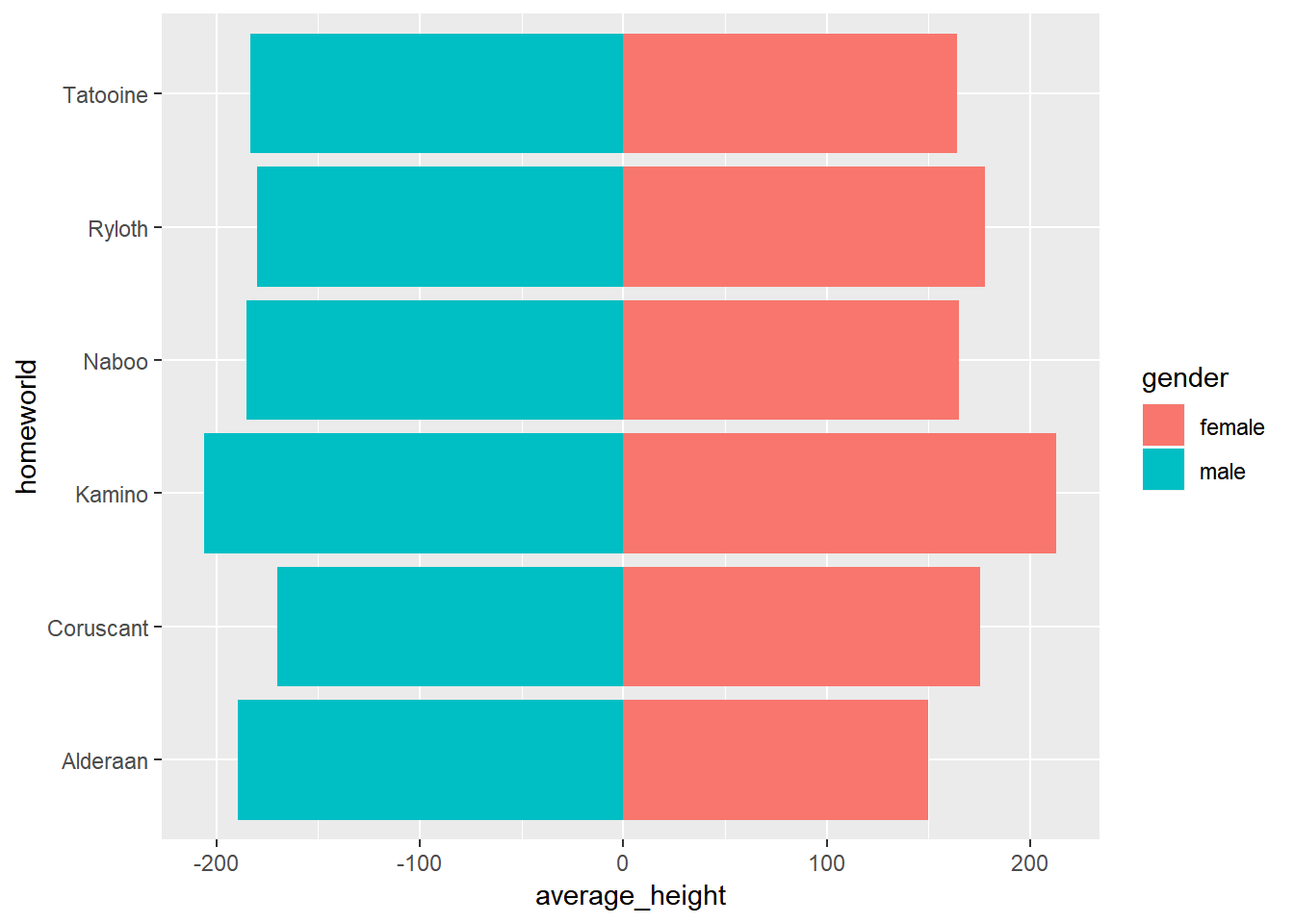
You can notice one issue here in the x-axis values. you have negative heights which is not reasonable so you need to set these values manually to reflect the absolute values.
For this, you can use scale_y_continuous(). Notice that it is scale_y_continuous() not scale_x_continuous() because we deal with the original aesthetics we passed before flipping the coordinates.
But how to set the breaks and labels values?
You have more than one option. For instance:
you can pass a vector with the exact values.
or you can use a more generic way that creates breaks based on the range of
average_heightin your data usingpretty(). For examplepretty(starwars_chars$average_height)will give the following values:
## [1] -300 -200 -100 0 100 200 300We will use this to specify the breaks. And to make sure the displayed values are positive, we can pass the absolute values to the labels attribute.
## calculate breaks values
breaks_values <- pretty(starwars_chars$average_height)
## create plot
starwars_chars %>%
ggplot(aes(x = homeworld, y = average_height, fill = gender))+
geom_bar(stat = "identity")+
coord_flip()+
scale_y_continuous(breaks = breaks_values,
labels = abs(breaks_values))+
theme_minimal()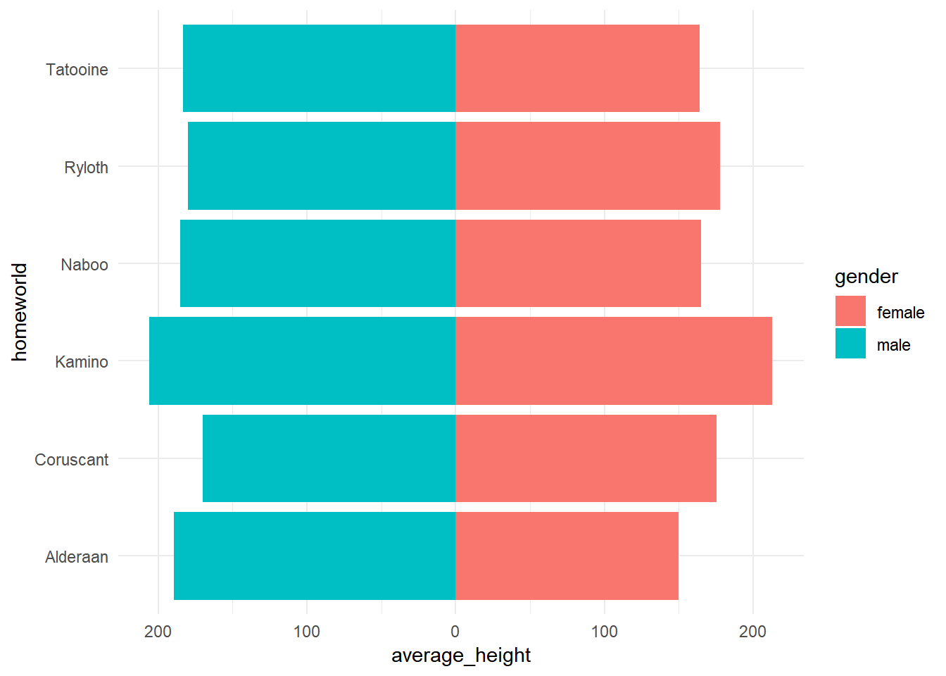 Now you can change the colors, add a vertical line at zero and customize your figure as you want.
## create plot
starwars_chars %>%
  ggplot(aes(x = homeworld, y = average_height, fill = gender))+
  geom_hline(yintercept = 0)+
  geom_bar(stat = "identity")+
  coord_flip()+
  scale_y_continuous(breaks = breaks_values,
                     labels = abs(breaks_values))+
  theme_minimal()+
  scale_fill_manual(values = c("#bf812d", "#35978f"))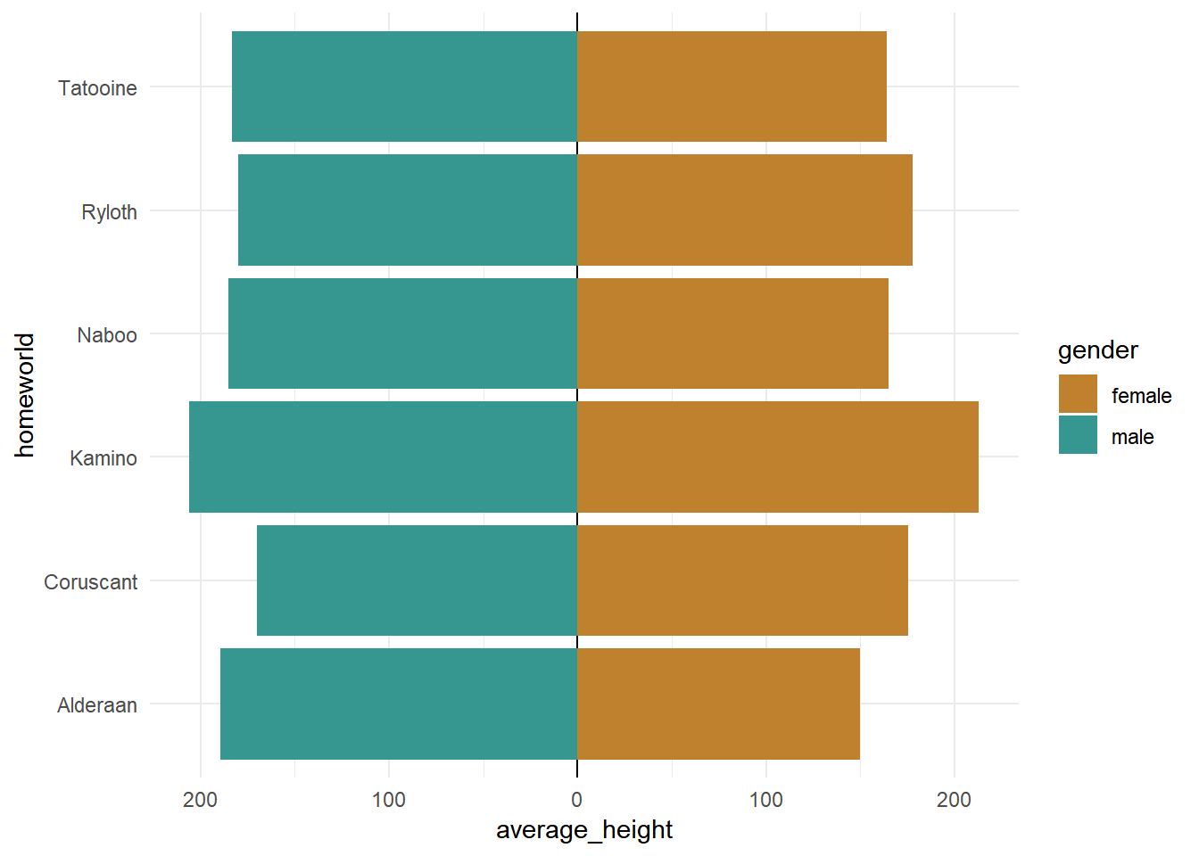
So these were simple examples with bar plots triggered by a question I received. But at the end picking a specific type of charts depends on the question in mind and the message one wants to deliver. And the good thing about ggplot2 that it gives the cotrol over your plot to do whatever you want.